
How to interpret an ensemble forecast
You’ve probably heard of ensemble forecasts. In recent years, they have taken on more of a starring role at leading forecast organisations like the Met Office and the ECMWF (European Centre for Medium Range Weather Forecasts). Both organisations have run ensemble forecasts for 20 to 30 years now, but previously as a supplement to their main “deterministic” forecasts. In particular, the ensembles were always run at lower resolution, with model grid-points up to twice as far apart in the ensemble as in the “high-resolution” deterministic model runs. Forecasters often had more faith in the higher resolution model and ensemble forecasts were, to a large degree, mostly used as a supplement to understand the uncertainty in any one forecast – to gauge confidence. However, that is now changing.
For some time, verification scores have shown clearly that ensemble forecasts have significantly more predictive skill than deterministic models, even though they are run at lower resolution. As a result, both the Met Office and ECMWF have independently taken the decision to use their latest supercomputer upgrade to bring the ensemble resolution up to the same as the previous high-resolution model, and phase out the use of single-realisation deterministic models. We will have ensemble-based Numerical Weather Prediction (NWP) systems underpinning all of our forecasting.
Ensemble-only NWP does not mean that every forecast you see will be presented as probabilities or with multiple solutions. Some forecasts will continue to be presented in simple deterministic ways but may be derived as a most-likely solution. Nevertheless, over time we might expect to see new ways of presenting more information based on the range of possible outcomes in the ensemble.
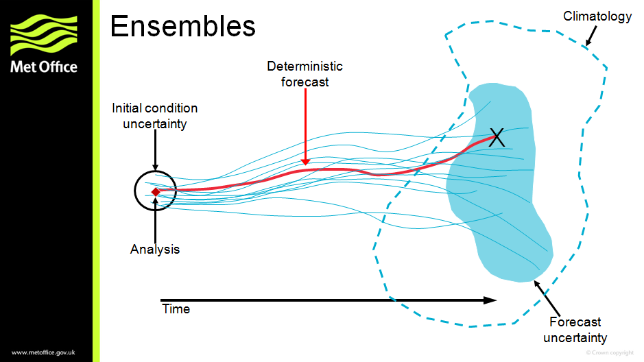
I designed this schematic diagram of an ensemble forecast (above) around 20 years ago. Over the years it has been used many times to illustrate how the different model runs in an ensemble can sample the uncertainty in a forecast, as well as help answer the common question of what a 30% probability actually means.
Recently, as part of our work to communicate more about the change to the ensemble-only NWP, I developed a new version of the ensemble schematic (below) which explores some of the ways that an ensemble can be interpreted. The new schematic more clearly defines the time that we are forecasting for, which also gives an opportunity to plot a graph of the probability distribution — showing how likely different values of any parameter are to happen. This could be any weather forecast parameter such as temperature, wind speed, rainfall amount and so on.
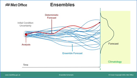
In the traditional deterministic forecast shown in red the model is initialised from the best-estimate analysis of the current state of the atmosphere and provides a single value for the parameter. It tells us nothing about how confident we should be in that value or even whether it is the most likely outcome. All we know is that climatology, shaded in green, gives us some idea of the range of values likely at the time of year — although with climate change even that may be changing! However, we do know how good our observations are and hence how confident we can be in the analysis — we can estimate the analysis error (uncertainty) shown by the dotted line around it. To create an ensemble forecast we make some small changes (perturbations) around the analysis and re-run the model several times (typically 20 to 50 samples) to form the ensemble (blue lines). These provide a sampling of the possible forecast outcomes and allow us to estimate the probability distribution shown in black. It is worth noting that this is not a nice smooth curve like a Gaussian or Normal distribution, for example, because it is an empirical sampling of the distribution by the ensemble members, not a fitted mathematical function. On some occasions solutions can even diverge into two separate groups, giving a bimodal distribution with two peaks, although this is unusual in practice.
Once we have the probability distribution it can be interpreted in several different ways which may be useful for different applications, as illustrated below. In part a) the distribution can provide a set of quantile values including a median (50th percentile), quartiles (25th and 75th percentiles) or more extreme values such as the 5th and 95th percentile illustrated. The median may be used as a simple best-estimate deterministic value, while a pair of appropriate quantiles could provide an empirical error bar on that estimate. A set of quantiles may be used to provide a fuller summary of the range of possible values, such as in a box and whisker plot. It is worth noting that as the ensemble distribution is empirical, the quantiles may not be evenly distributed either side of the median in parameter values. An alternative way to show the ensemble range could be to simply use the maximum and minimum values from the ensemble members, as illustrated in part b). A key difference here is that whereas the quantiles in part a) may be interpolated between ensemble members, in part b) we are explicitly using the parameter values from specific ensemble members — here the maximum and minimum (at this location and for this parameter).
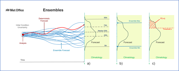
Ensemble forecasts are perhaps most often associated with generating probabilities, and this is illustrated in part c) where the probability of exceeding a threshold value is given by the area under the distribution bounded by the threshold value. Such probabilities are generally most useful when the threshold represents some level beyond which the weather parameter is likely to have significant impacts. One of the best known is the simple “Probability of Precipitation”, which may indicate that you may wish to carry an umbrella or bring your washing in. Probabilities are often useful for more extreme events with potentially higher impact, for example heavy rain rates liable to cause flash flooding, or strong winds capable of bringing down trees.
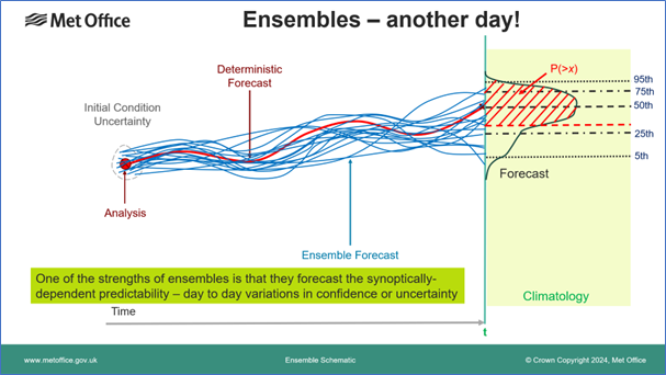
Any of the diagnostics or outputs illustrated above could be generated much more cheaply by simply measuring the historical error statistics of forecasts, and adding a standard error distribution to a deterministic forecast. However, the real power of an ensemble approach is illustrated in the final schematic above, which shows an alternative ensemble forecast, perhaps on a different day in a different synoptic environment. In this case the spread of the ensemble members, and hence the probability distribution is much narrower, giving smaller error bars and greater forecast confidence. Such a distribution will often offer so-called “sharper” probabilities — probabilities closer to 0 or 1 allowing more clear-cut decisions. This synoptic dependence, where the degree of spread varies from day to day and predicts the degree of confidence, illustrates the real power of an ensemble to extract the best predictive skill in a forecast.
About the Author

Ken Mylne is a Science Fellow in the exploitation of ensemble and probabilistic forecasts at the Met Office.
After early research in pollution dispersion and six years as an operational forecaster, Ken returned to research in ensemble forecasting where he led the development of the Met Office’s MOGREPS ensemble system and its applications.
Over many years, Ken has played a leading role in developing the science and demonstrating that probabilistic forecasts provide greater prediction skill and can support better decision-making by users.
He has also played a leading role at the World Meteorological Organization, supporting forecasting capabilities for disaster risk reduction worldwide.


